Design Work

Grace Abounding in OCD Website Redesign
Key Points
- Original Website: https://graceaboundinginocd.com/
- Software Used: Adobe XD, Adobe Illustrator, Adobe Firefly
- Skills Used: Information Architecture, Design Proposal Drafting, Wireframing, Prototyping, UI/UX Design, Color Theory, Color Psychology
Description
I was tasked with creating a fully functional prototype for a website redesign using Adobe XD. I chose a website that has been deeply impactful to me but lacked stellar design. I began by creating a moodboard to nail down the style I was going for. I decided to create a vintage feel with a subtle paper texture background and a hand sketched aesthetic. I combined this with a color palette of beige, muted purple, and off-black. I chose this due to purple's associations with the mind. The combination of muted tones and the beige create the desired effect of calming the visitor to the site. These choices were made to accomplish the purpose of the site as set out by its owner.
After making decisions from the moodboard, I designed the information architecture for the site and laid it out in a flow chart. Then I moved to draft a design proposal including the process, the direction chosen, the timeline, and the price. Finally, I began to layout the design in Adobe XD. To save time, I made good use of Adobe Firefly to generate images matching the style I selected for the website. From there I took the generated images into Adobe Illustrator and made any necessary changes.
Urban Gardens Website Design
Key Points
- Software Used: Adobe XD, Adobe Illustrator, Adobe Photoshop, Adobe Firefly
- Skills Used: Information Architecture, Design Proposal Drafting, Wireframing, Prototyping, UI/UX Design, Color Theory, Color Psychology, Prompt Engineering
Description
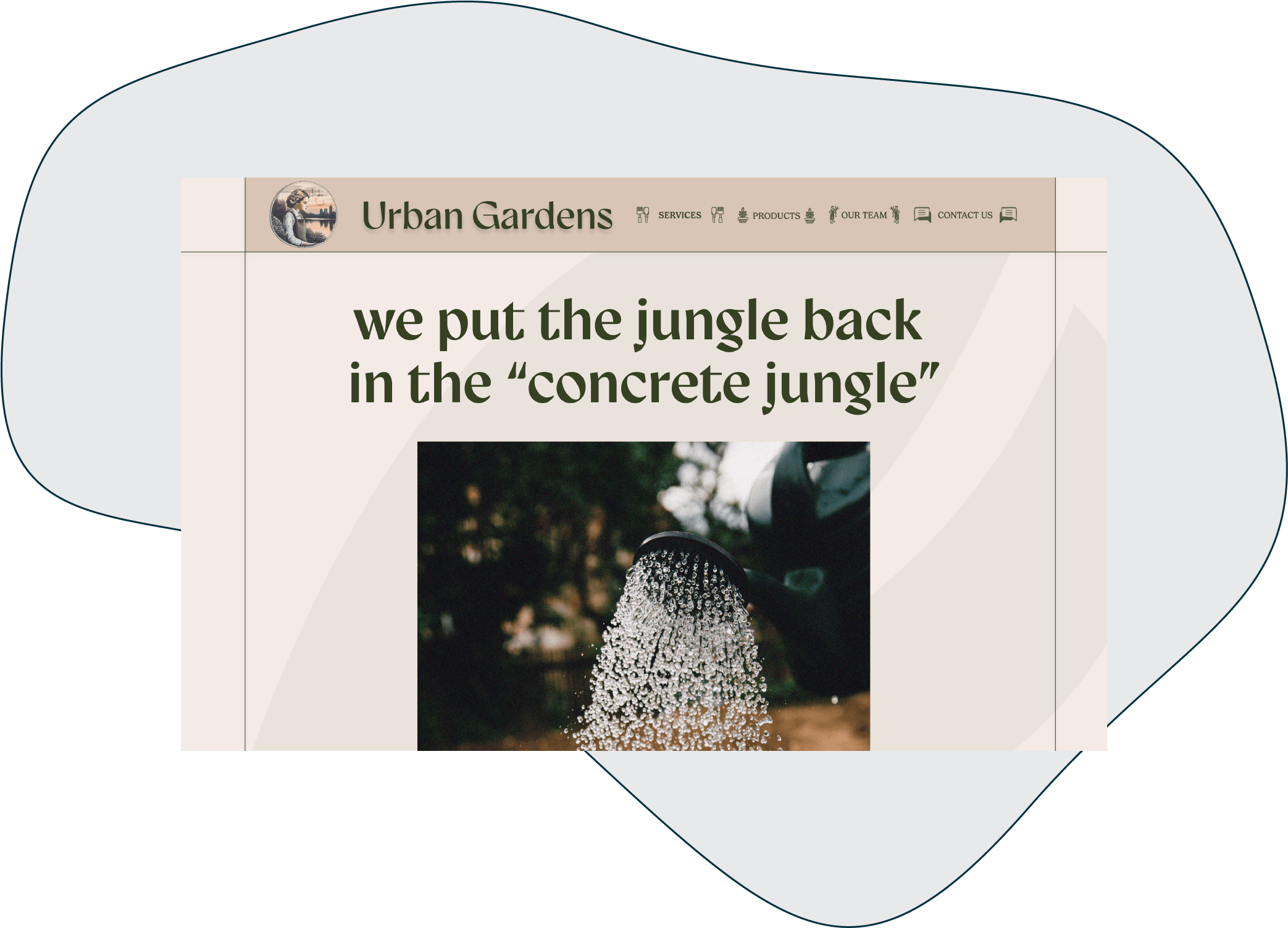
This was a project wherein I was given a basic concept for a business but few details. I began by building out the details of the company for which I was designing a website for. Once I had determined the history, mission, goals, and brand of this hypothetical client, I started sketching potential wireframes. From here I created a moodboard to finalize the direction I wanted the visuals to take. I chose to go in the direction of a modern and minimalist theme for the site. As such images would have a grainy, lo-fi effect on them and the color palette I chose consisted of neutrals with a green to offset. A design proposal was then drafted identifying these things and offering a timeline and cost.
From that point, I began to implement the specifics into the basic wireframe that I had built by finding and generating images and adjusting them as needed in Adobe Photoshop and Adobe Illustrator. I also used ChatGPT to generate the copy for this site according to my specific promptings. I used my knowledge of typography to find fonts that would also match the theming and brand voice that I had created. Finally, I added basic functionality to the wireframe, turning it into a prototype.
LegenDairy Vegan Cheese Branding
Key Points
- Software Used: Adobe Illustrator
- Skills Used: Logo Design, Packaging Design, Vector Illustration, Ideation, Branding, Style Guide Creation, Mockups
Description
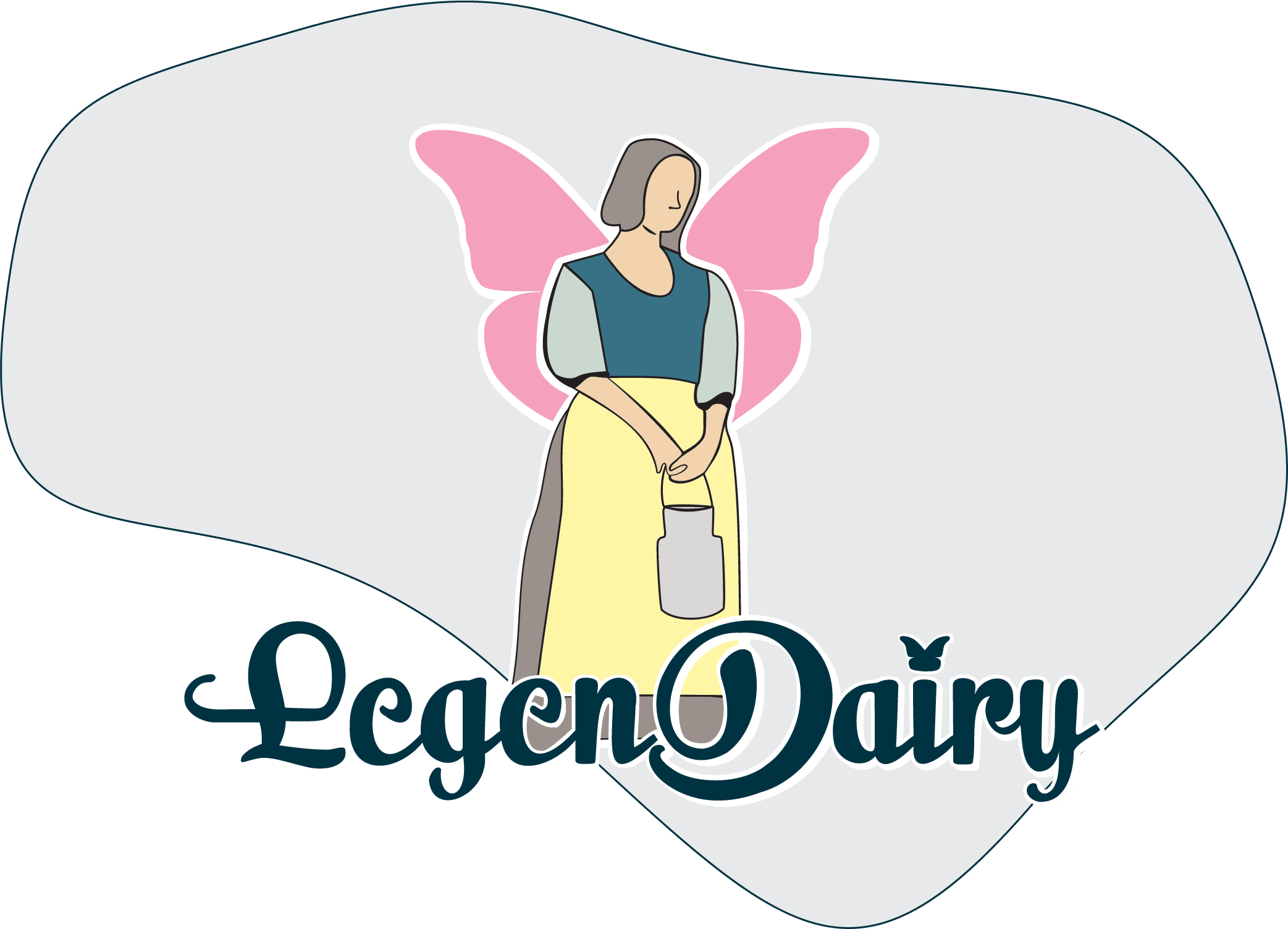
I was given the brand name LegenDairy, a vegan cheese company, and a design brief that required me to make reference to a mythical creature in the logo design. From there I began to sketch out the ideas that came to me. I settled on the concept of a fairy milkmaid as I felt that it conveyed the concept of a cheese having magical properties, as it was not made from milk, yet still having a handmade, quality, human touch to it. I customized a typeface that was already rounded and conveyed a sense of fluidity to it so as to accentuate the friendly and natural feel of the brand. It also was a nod to the missing milk. I chose colors that would evoke a vintage feel and cause the consumer to think back to an old farm and the milkman.
With all of this decided, I put it together in my vector illustration program. I also used mockups to create packaging for the brand. The colors were customized for each type of cheese. I finished the process with the creation of a style guide which formalizes how the various assets should be used in relation to each other. It includes a type scale and the official color palette with the color codes.
Elysium Art House Social Media Ad
Key Points
- Software Used: Adobe InDesign
- Skills Used: Layout Design, Diecut Creation, Social Media Marketing
Description
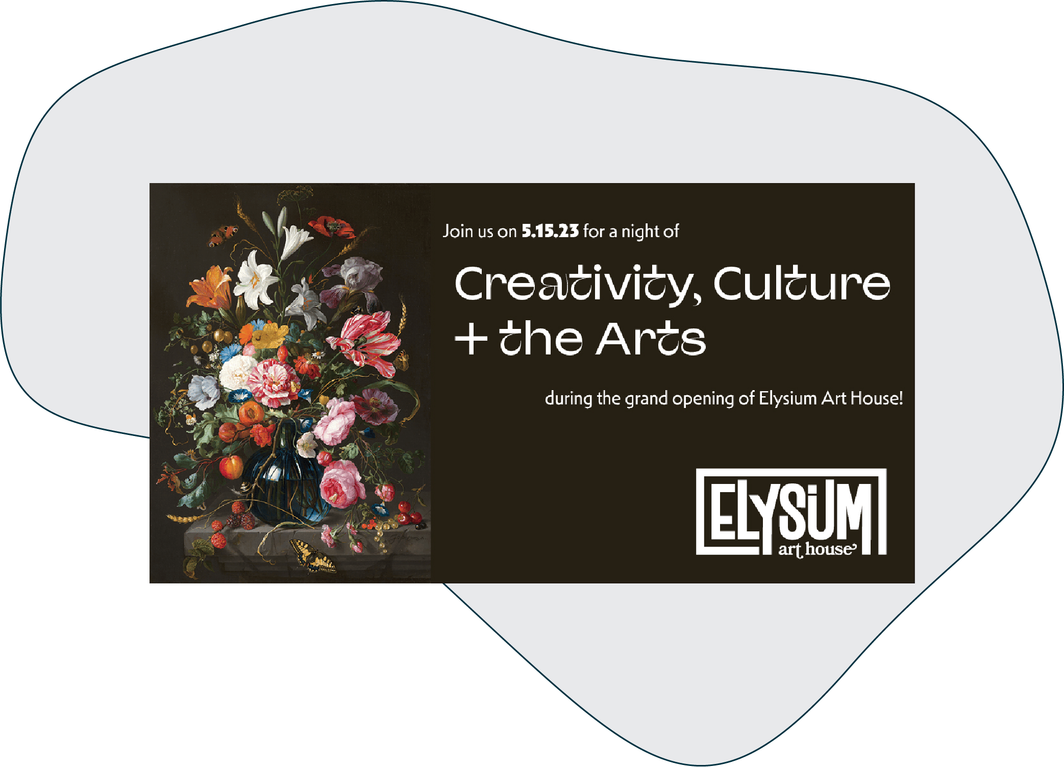
This project called for the creation of a die-cut invitation to the grand opening of a new art house. What is featured here is the social media advertisement for Facebook that would accompany physical invitations which would be sent out. I decided to feature one of the pieces of art that was in the physical invitation prominently on the ad. Using Adobe InDesign, I was quickly able to make several variations of the ad for LinkedIn, Instagram, and Twitter.
Cover & Interior Design of The Brothers Grimm
Key Points
- Software Used: Adobe InDesign, Adobe Illustrator, Adobe Firefly
- Skills Used: Graphic Design, Layout Design, Typographic Hierarchy, Printing, Font Selection
Description
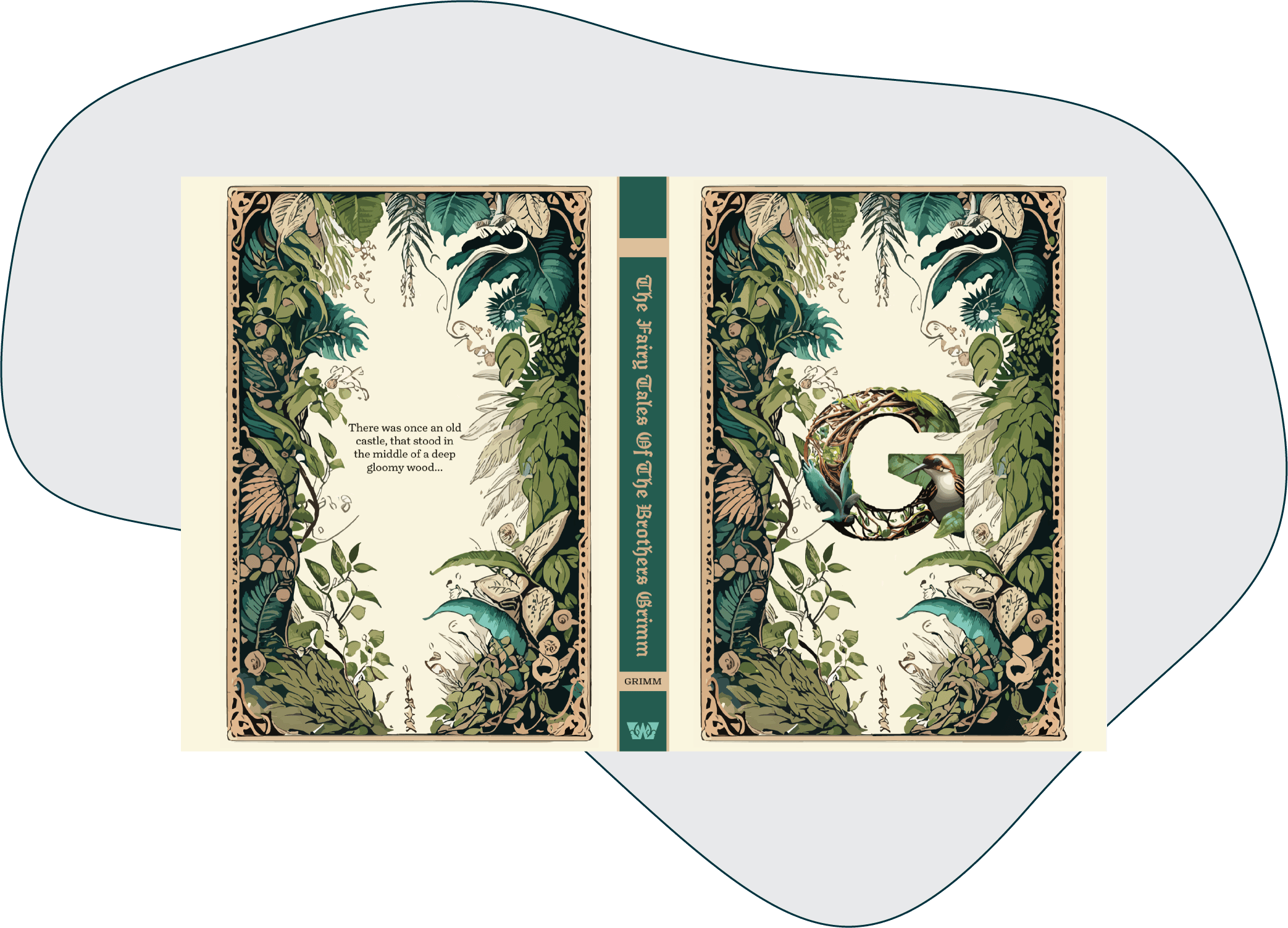
This project entailed designing a book from the ground up. I was given the text of the Brothers Grimm completely unformatted and had to format every sentence, paragraph, and page so that it would be legible, attractive, and intuitive. I also was tasked with designing the cover and spine of the book. I decided to design the book in the style of a modernized illuminated medieval manuscript. The assets on the cover were created using Adobe Firefly and then brought into Adobe Illustrator for significant fine tuning. I then took pieces from the cover and incorporated throughout the pages of the book as a means of tying it together as a cohesive whole.
Professional book design decisions were made for this work. You will notice that each paragraph meets the next without a space. This is because indents were selected to denote the beginning of each paragraph. In professional printing, you can select one method or the other, but not both. Also of note is the colophon designed to look like a Turnip. This is an homage to the typeface used for both its legibility and old European flair, Turnip.
The layout had to be done with printing in mind. The finished manuscript and cover design were sent off to a professional printer so that a physical copy could be made. This means that each measurement had to be precise and exact or the entire work could have been destroyed. It was executed precisely right and printed as intended. The PDF version of the book can be viewed by clicking below.
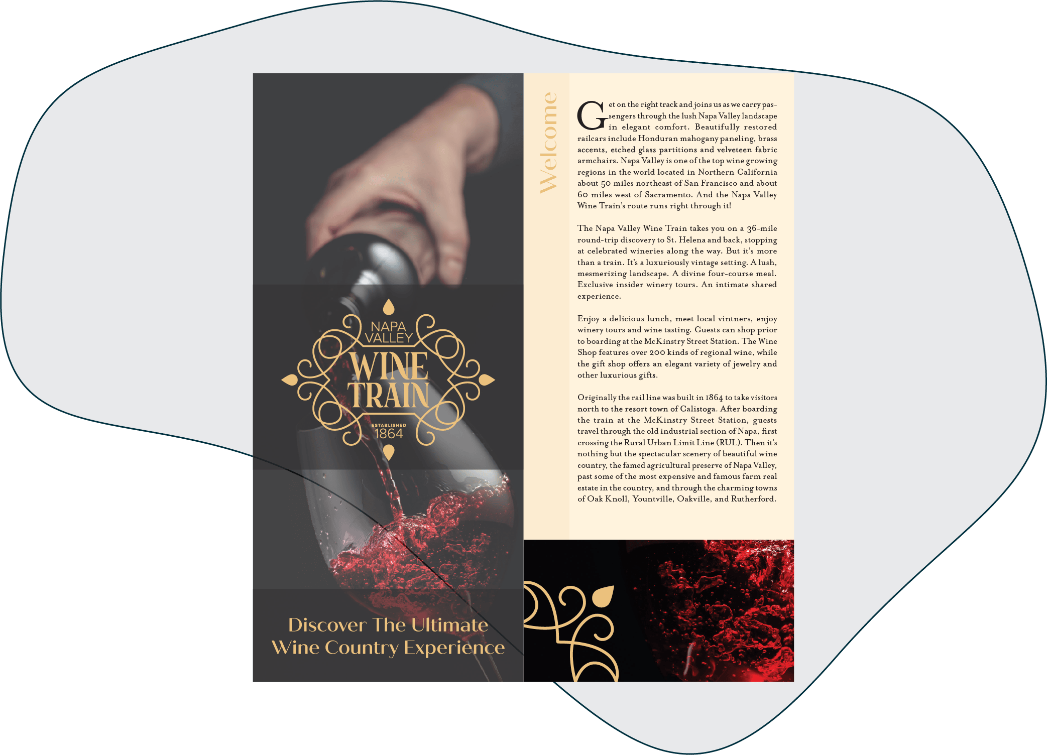
Napa Valley Wine Train Trifold Brochure
Key Points
- Software Used: Adobe InDesign
- Skills Used: Graphic Design, Layout Design, Typography, Printing, Folding
Description
In this project, many assets were provided in advance, as was the copy. This was mostly an exercise in playing with color, type, and one fantastically high resolution photo of a wine glass. The visual arrangement of elements in this trifold allow each to evoke a sense of elegance and sophistication fitting of the Napa Valley wine tasting experience. I used Adobe InDesign to arrange the pieces and fine tune the typography. InDesign was also used to place where the folds would need to go for the printed brochure.
Once the design was complete in InDesign, I had to adjust the print settings and ensure that the document printed correctly. From there I proceeded to take the printed version and utilized special tools to ensure a perfect crease on each fold line. The PDF version can be viewed below, however, it does not appear as a trifold because much of that exists in the printing settings.
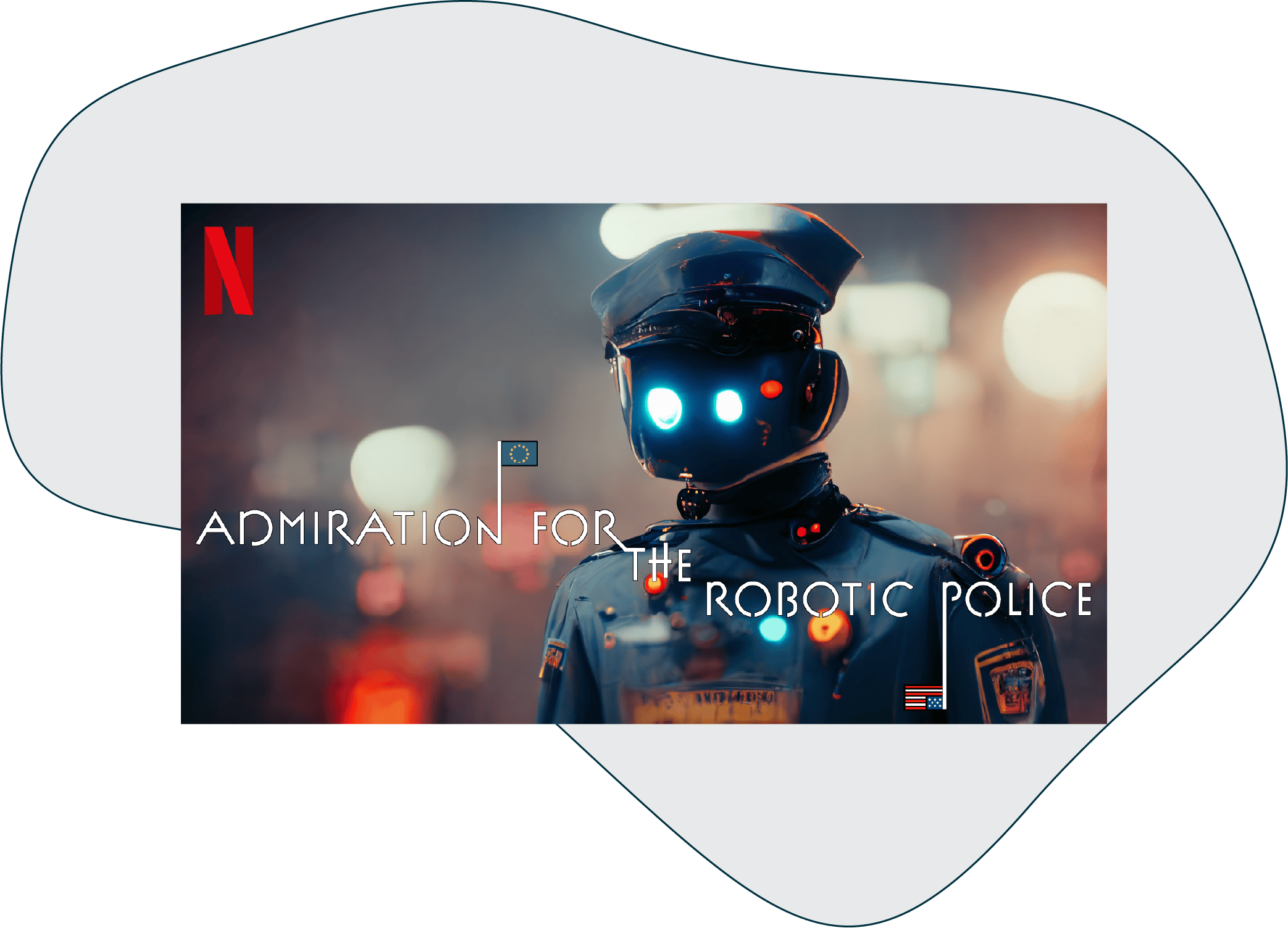
Netflix Title Card
Key Points
- Software Used: Adobe Illustrator, Adobe Firefly
- Skills Used: Graphic Design, Typography
Description
This project was a blast! I was instructed to randomly generate a 3-5 word title for a Netflix show. I received “Admiration for the Robotic Police” back from the generator. I envisioned it as a dystopian sci-fi political action thriller. I used Adobe Firefly to generate the background image. As it was an earlier version of that program, the image came out a bit distorted and malformed. I believe that actually adds to the effect it has. It creates the eerie and unsettled atmosphere that I had desired. The way it both intently stares at the title while also staring blankly off into space highlights the impression that this is a soulless and emotionless automaton.
Once the image was chosen and placed, I set about designing the title treatment. I chose a font that felt futuristic but also playful to be ironic. I found some icons and colorized them and merged them with the stems of letters that I extended to turn into flag poles. This was done to highlight the political aspect of the show. With that, the project was done and communicated all the messages that I wanted the title card to get across to the viewer. These Netflix title cards only have a short moment to convince a viewer to click on it and get more information, which is something I feel this design effectively accomplishes.
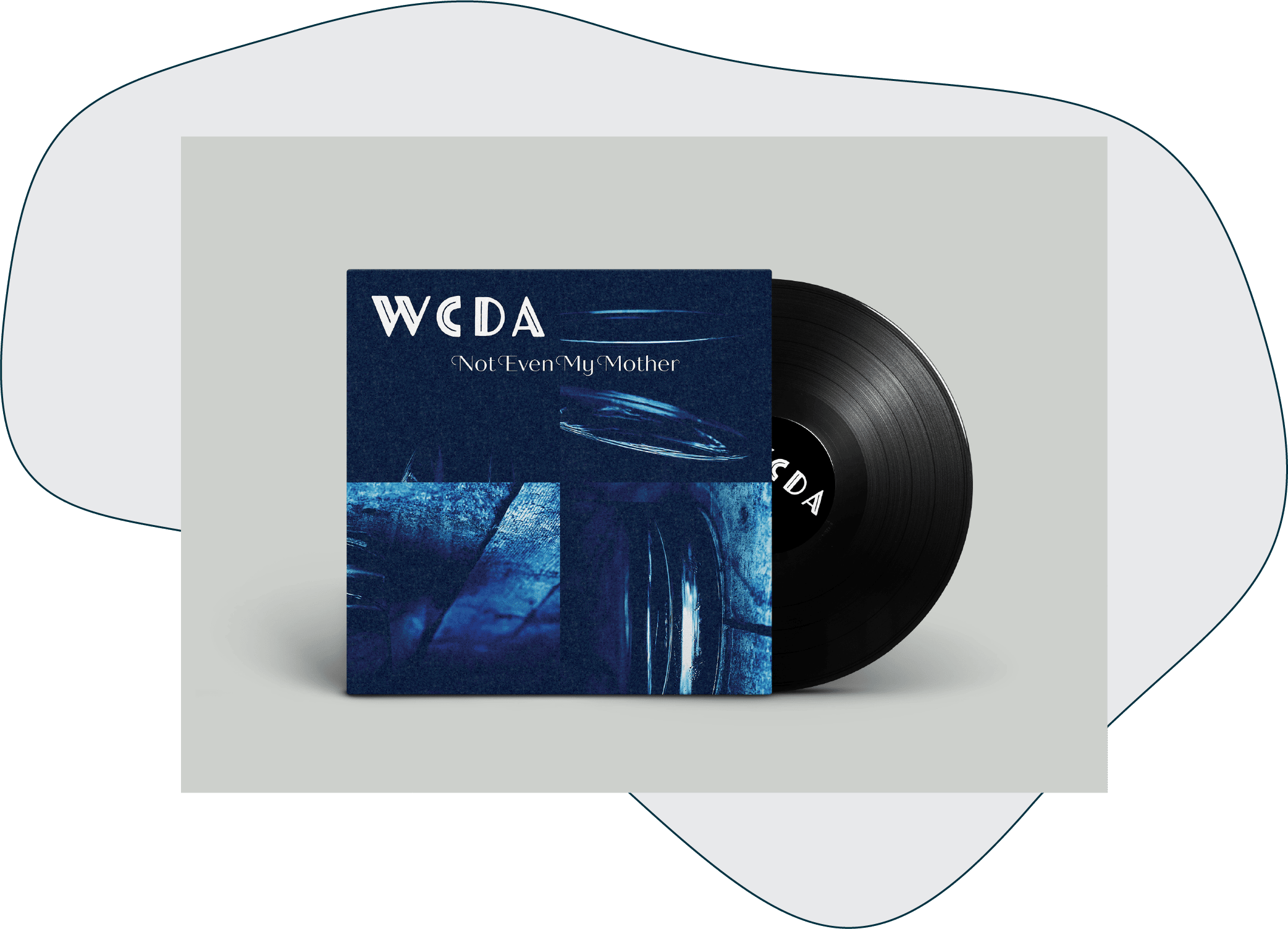
Album Cover Design
Key Points
- Software Used: Adobe Photoshop
- Skills Used: Graphic Design, Typography, Typographic Voice, Photo Manipulation, Communication
Description
This was one of my favorite design projects that I have done. It is an exploration of typographic voice, using fonts to convey different emotions, by designing album covers for different genres. However, I was given boundaries to work within. I got a random photo and a random title. I had to use the same photo and title for all the different genres, but I could edit the photo however I wanted and I was required to use different fonts for each genre. The point is that by simply using a different typeface, an entirely different emotion can be conveyed to the viewer. The four genres are classical, country, rock, and techno. The PDF displays them in that order.
For the classical album, I chose an art deco font for the label and a basic script font for the title to convey elegance and harken back to a prior time. The photo of a glass which I was given, I then chopped up into four pieces and rotated each in different direction. Next, I added grain to the pieces and overlaid it all in a calming blue. This creates a tension between dissonance and consonance. There is both a calming in the font and color, but a tension in the random rotation and broken up images now made grainy.
For the country album, I chose a rough, textured font for the label and a handwriting based script font for the title. The photo of the glass is left unaltered for the most part. This is to communicate the simplicity of the country man. The text of the title has been adjusted to meet the curve of the liquid in the glass. This draws the eye to the liquid and makes the viewer question what the contents of the glass really are.
For the rock album, I chose a font that puts each letter at a different size and hight so that nothing really lines up. For the title I chose a very punchy yet squat, all caps font. The image is flipped upside down and the highlights are turned up. All is overlaid in red. This all comes together to make it feel like the whole composition is in ordered disarray and being compressed in emotion and anger
For the techno album, I chose a font that is very angular and futuristic for the label and a pixel based bitmap font for the title as direct throwback to the old days of computing. The image of the glass as been warped and distorted so that the glass now looks like sound waves. All of it is overlaid with a green that is reminiscent of a hacker’s screen.
Development Work
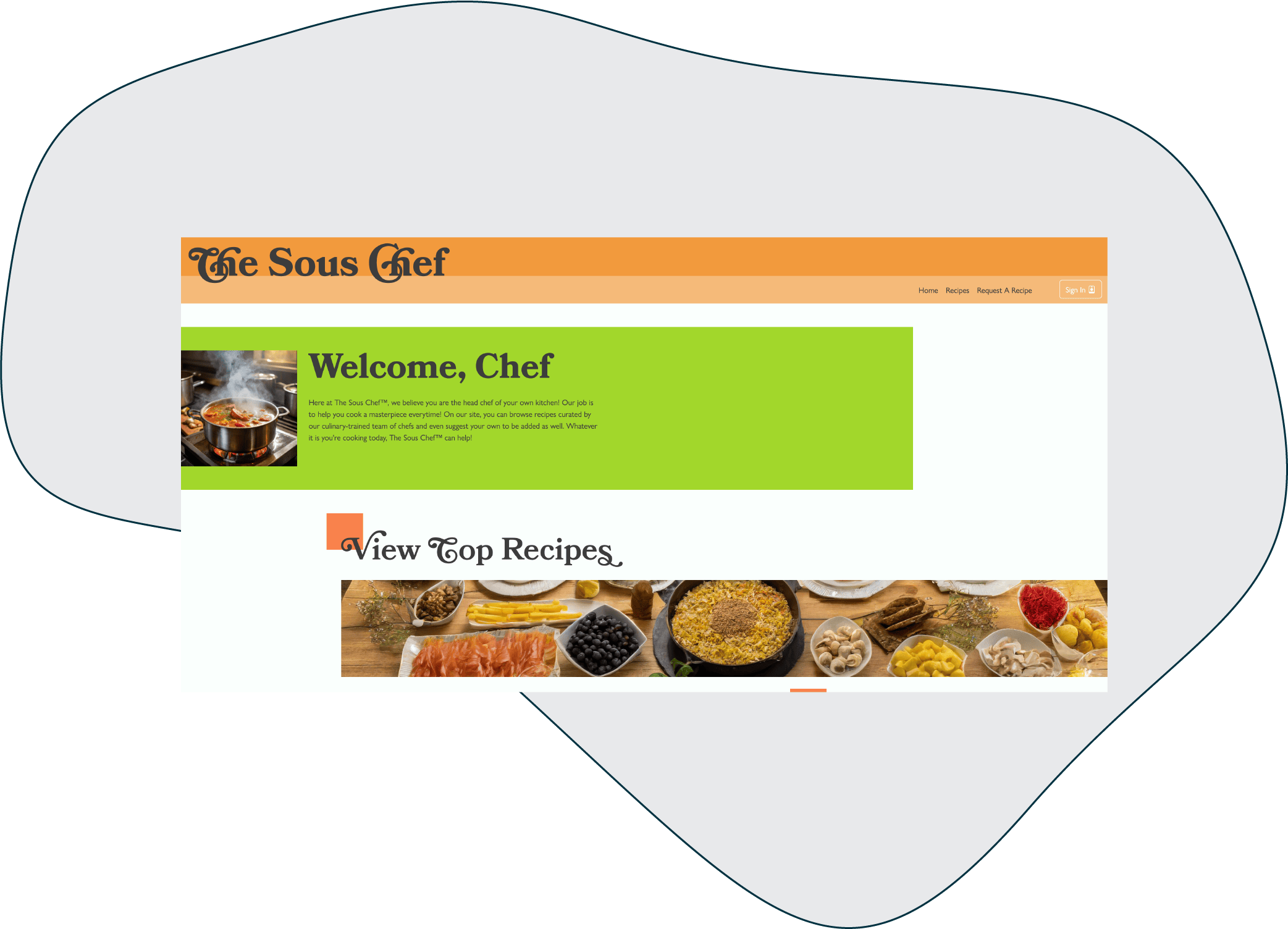
The Sous Chef Website
Key Points
- Technologies Used: HTML, CSS, JavaScript, PHP, Bootstrap, SASS, MySQL, Git
- Skills Used: Web Design, Coding, CRUD Operations, Session Variables, Prepared Statements, AJAX Calls, JSON, Cookies, Local Storage, Dynamic Content, Animations, Honeypot Form, Error Handling, SMTP Mail, MVC, Object Oriented JS, Object Oriented PHP
- Note: Log in with wdv341 as username and password.
Description
This is the capstone website for my Web Development AAS which demonstrates the technical ability I possess in a wide array of technical coding and web design. It incorporates both front end and back end technologies and it features a live connection to a database which the site dynamically displays content from. The site features an admin section where new recipes can be added to the database to display on the front end. This all happens dynamically each time the site is loaded. It also features many forms and pages that update according to user input. The site communicates back and forth by sending data in JSON and then decoding it between PHP and JavaScript respectively. The PHP contains prepared statements to access the MySQL database that underpins the whole site. The site also performs CRUD operations, allowing full admin control from the website while logged in without the need to visit a hosting account control panel. The visuals of the site feature complex animations and provide ample user feedback. There is also a Git repo that contains all the PHP code. This can be found by clicking the GitHub logo in the footer.
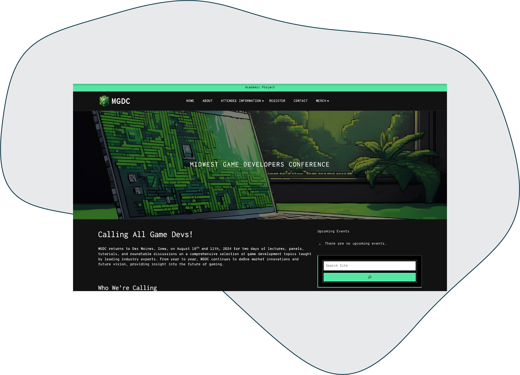
Midwest Game Developers Conference Website
Key Points
- Technologies Used: WordPress, Stripe, CSS
- Skills Used: Themes, Plugins, WooCommerce, Web Design, UI/UX
Description
This site is the final project for my WordPress course. It encompasses all the skills that I learned that semester. Of course, since then my abilities have grown through my freelance work. For this site, I was required to build a site for a game development conference. This was chosen to maximize the types of content I would have to consider in my design of the site to maximize usability. There were events that had to have details and be part of the overall conference schedule. The speakers had to be listed out. There were various registration forms with conditional logic that had to be built. An e-commerce portion had to exist to support a merch store. This required WooCommerce with full Stripe test mode. Widgets were used to increase the ease of navigation so the user did not have to go through the menu to find the page where information was located. Instead the information would come to the user. The provided graphics for the project were not very pleasing to look at, so I took it on myself to attempt to create all the graphics on the site using Adobe Firefly and then editing what was required. To go with the game development topic, I designed the site around the black and green hacker screens you seen in the movies and for the images, pixel art was the jumping off point to bring to mind the childhood Nintendo games we all played.